Tipsy Trout
Interior Design/Branding/F&B Concept
Stowe, Vermont
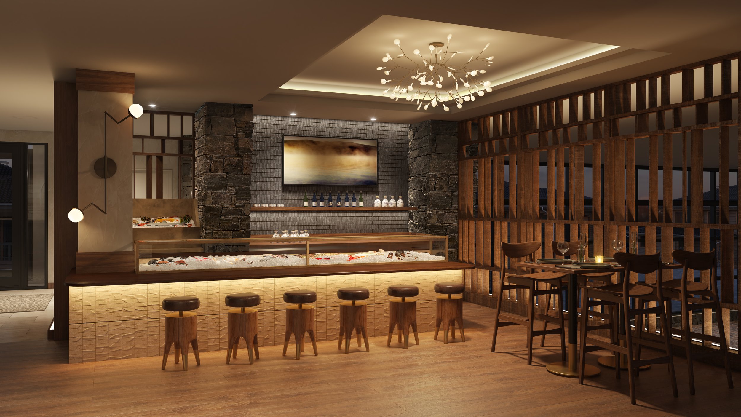
Tipsy Trout takes inspiration from the terrain of the mountain— the richness of its contrasting textures will relax visitors and inspire them to reflect on their treks through Stowe. The texture, the feel of a mountain’s various terrains are the result of a complex alchemy of stone, wind, and altitude, of flora and fauna—all flowing together, yet sometimes shifting abruptly, creating entire worlds to explore and appreciate.


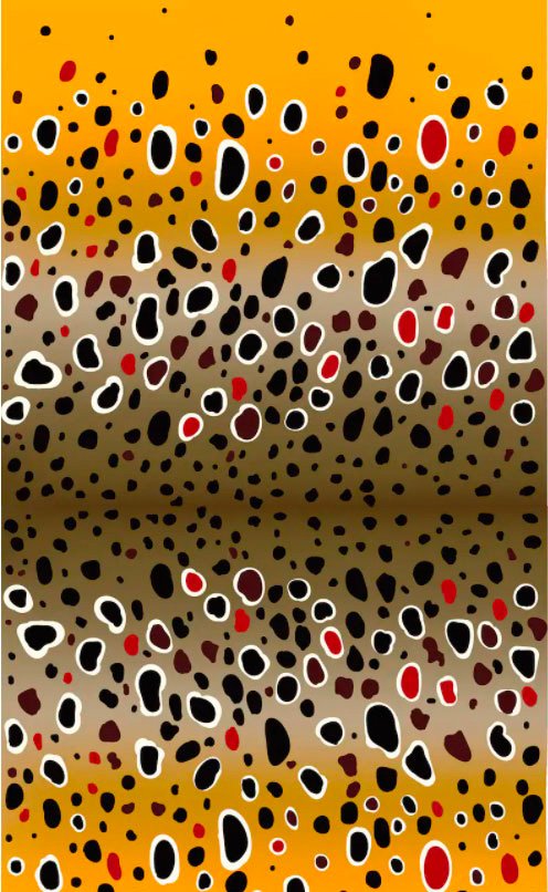
Only those who traverse through the mountains will experience these worlds of wonder, each its own study in contrasts, from lush evergreen forest to alpine tundra.
Food & Beverage Concept Development
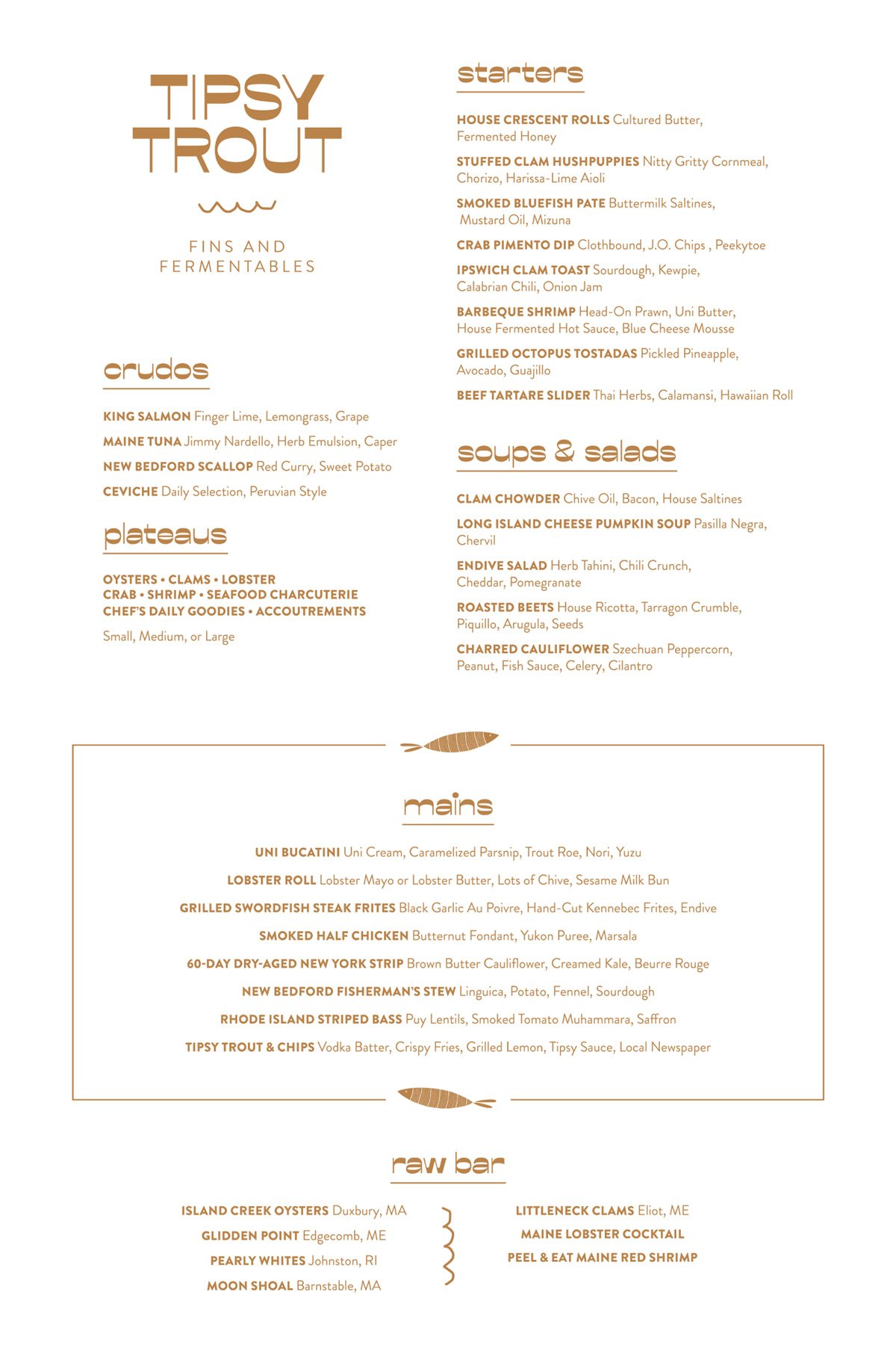
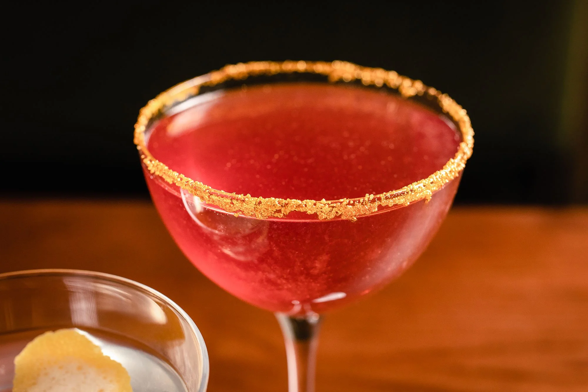
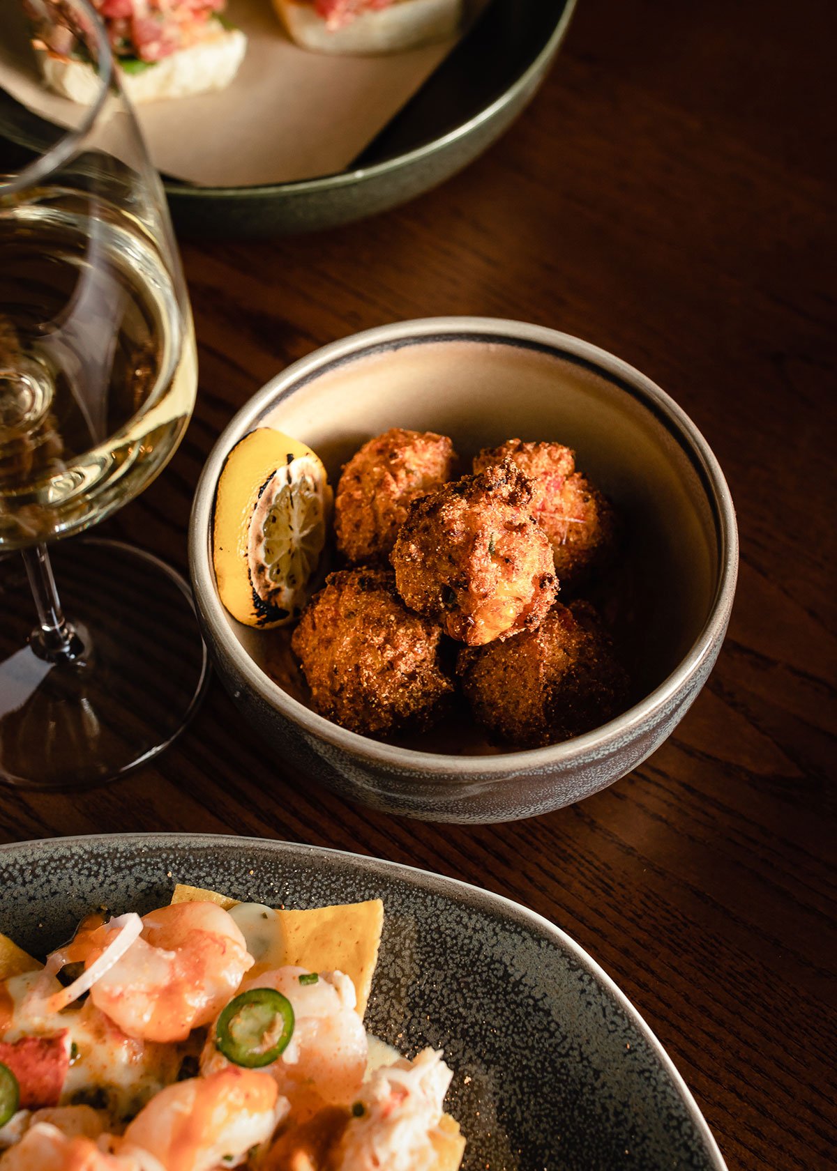
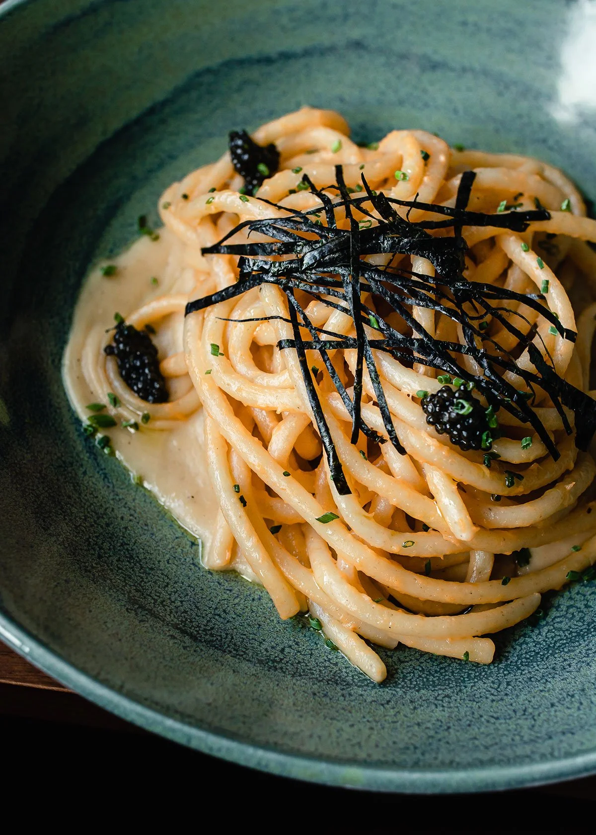
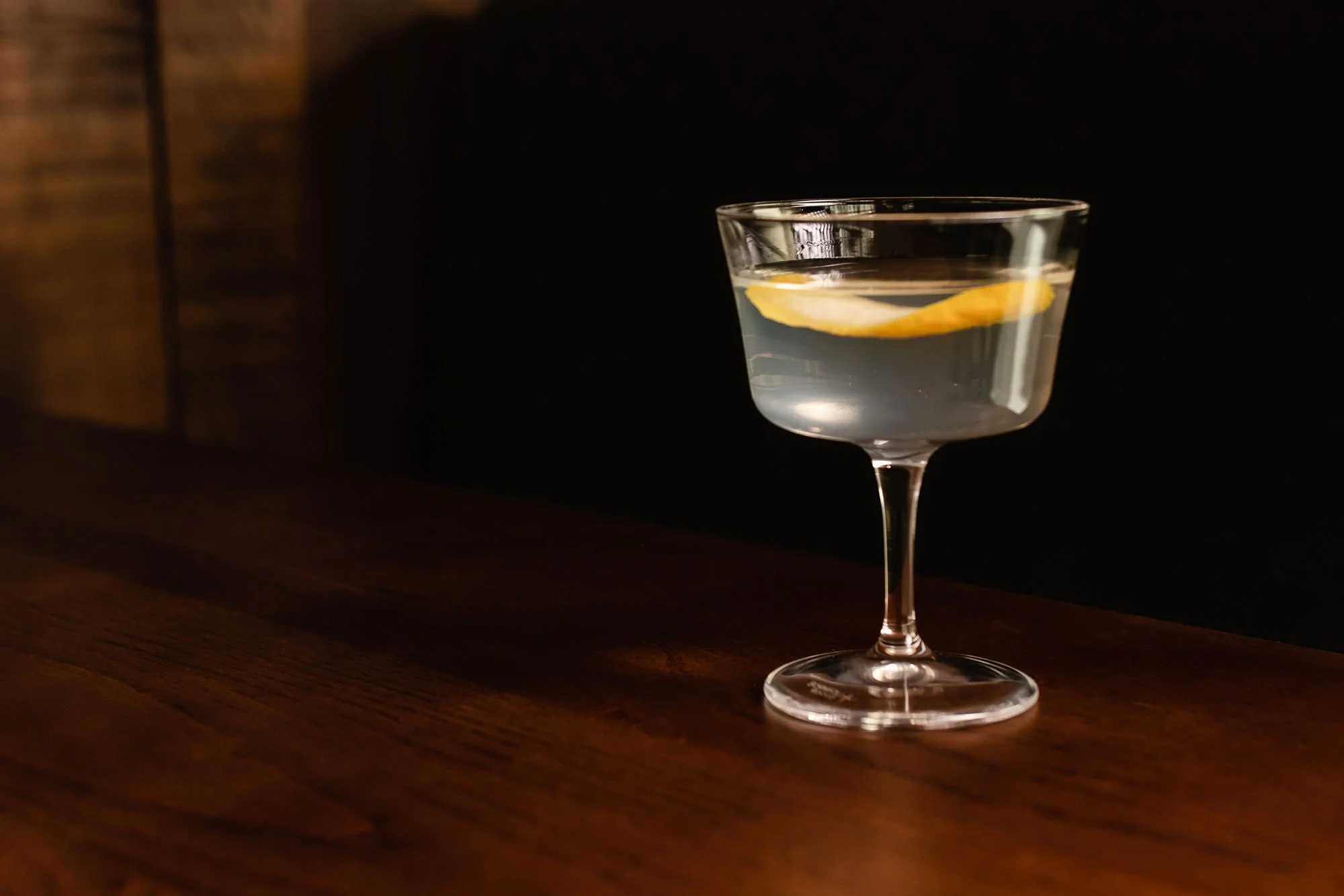
Tipsy Trout brings coastal seafood into a Vermont context—pairing freshness with a more grounded, regional sensibility. The menu is structured for repetition, with small plates and raw bar offerings that encourage ongoing engagement rather than a fixed meal.
The raw bar anchors the experience, setting the tone for interaction and pace. The bar drives energy, with cocktails leading and wine supporting. The space is lively and open, allowing guests to move, gather, and settle in naturally. Seafood becomes part of a continuous experience, not a singular occasion.
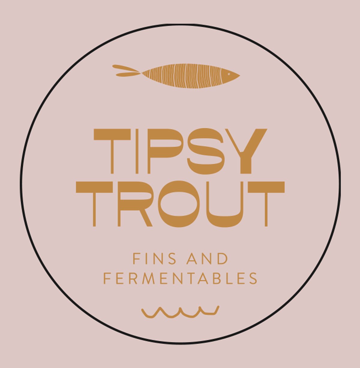
Branding & Identity Development
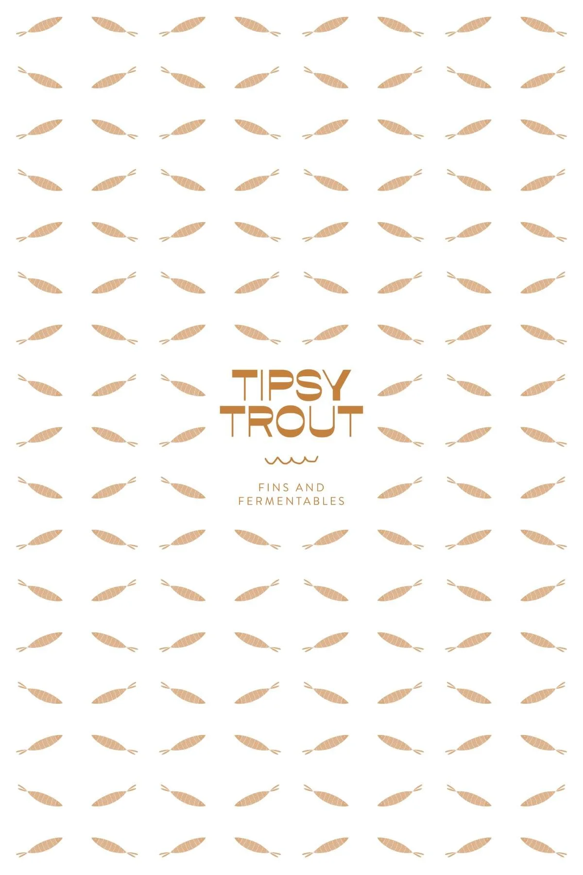
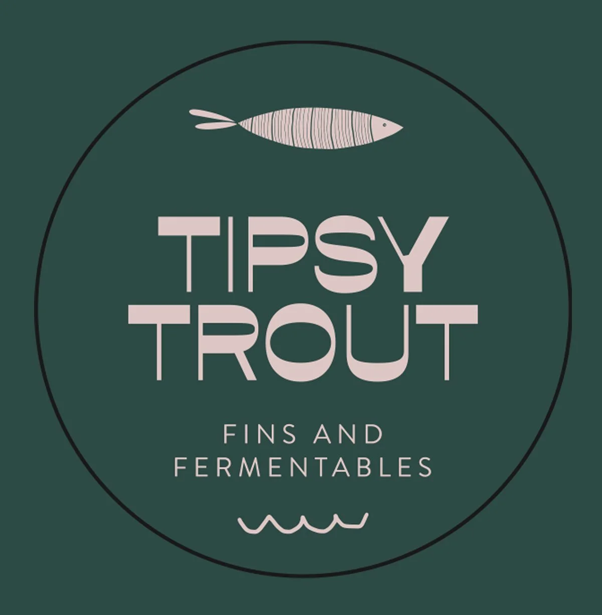
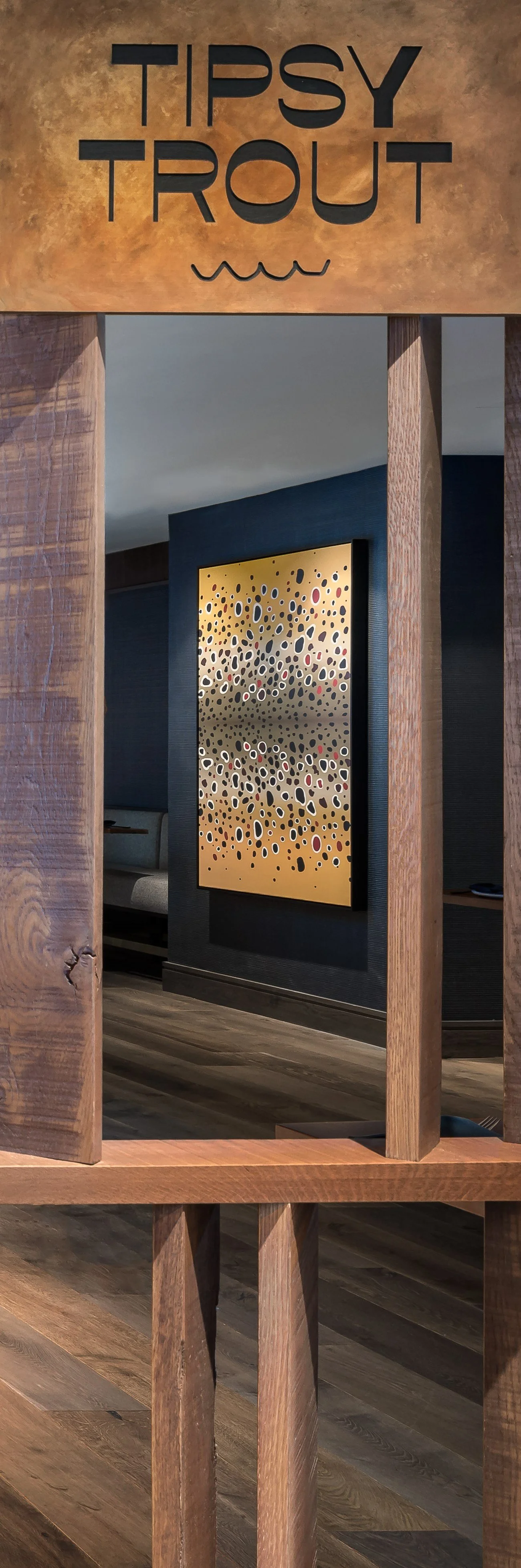
The Tipsy Trout mark features a typeface with a reverse contrast to the letterforms. This means the letters are thick where they would be traditionally thin, and vice versa. This affectation gives the mark a playful, woozy feel, and hints at the party the brand represents.