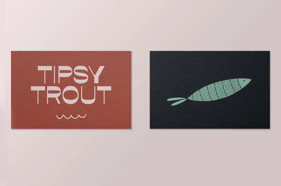
The Tipsy Trout mark features a typeface with a reverse contrast to the letterforms. This means the letters are thick where they would be traditionally thin, and vice versa. This affectation gives the mark a playful, woozy feel, and hints at the party the brand represents.
The trout illustration is reminiscent of ‘60s era art and, in combination with the typeface, speaks to a nostalgia for the golden age of skiing and play on the mountain, an era of fun, freedom, and luxury.