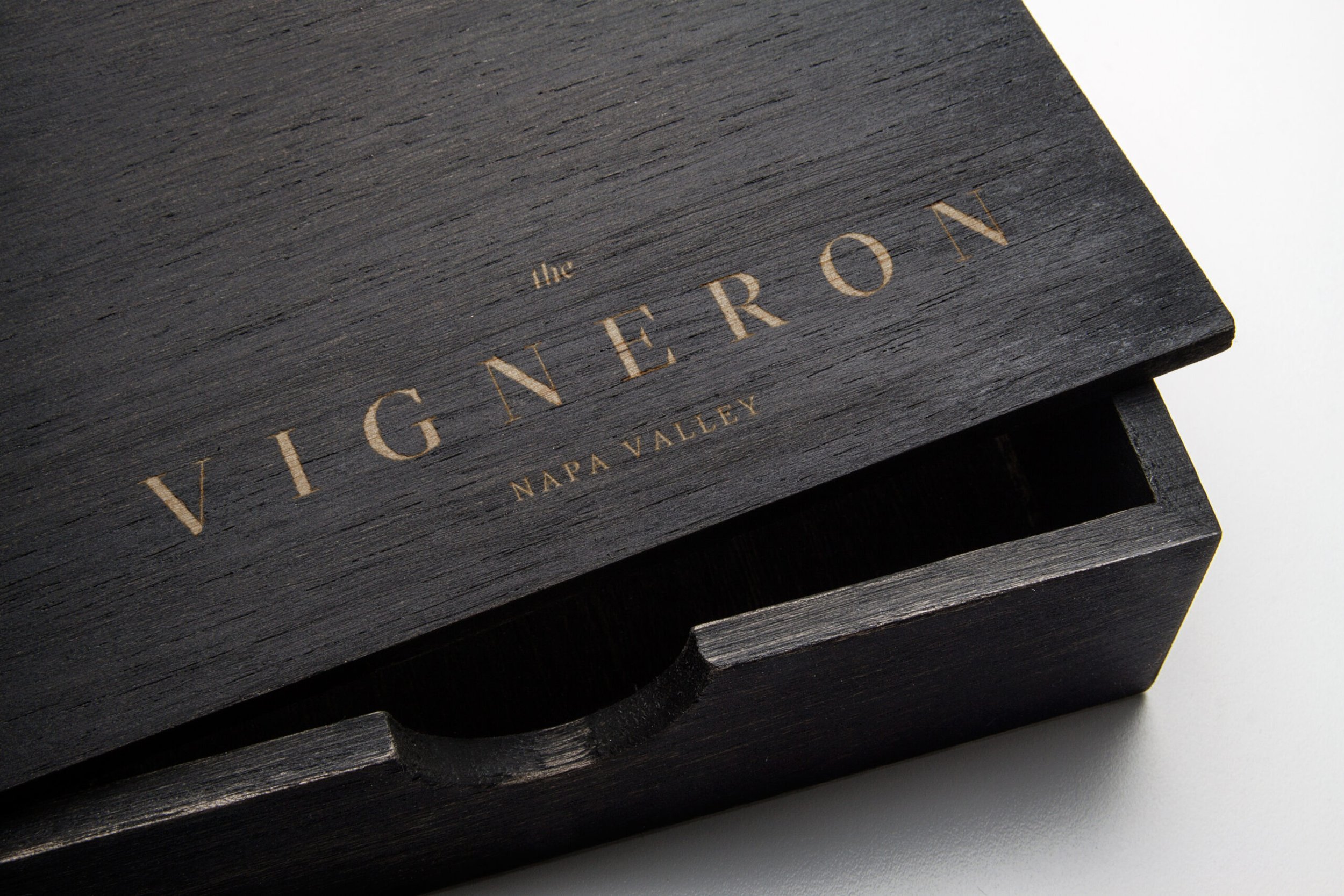
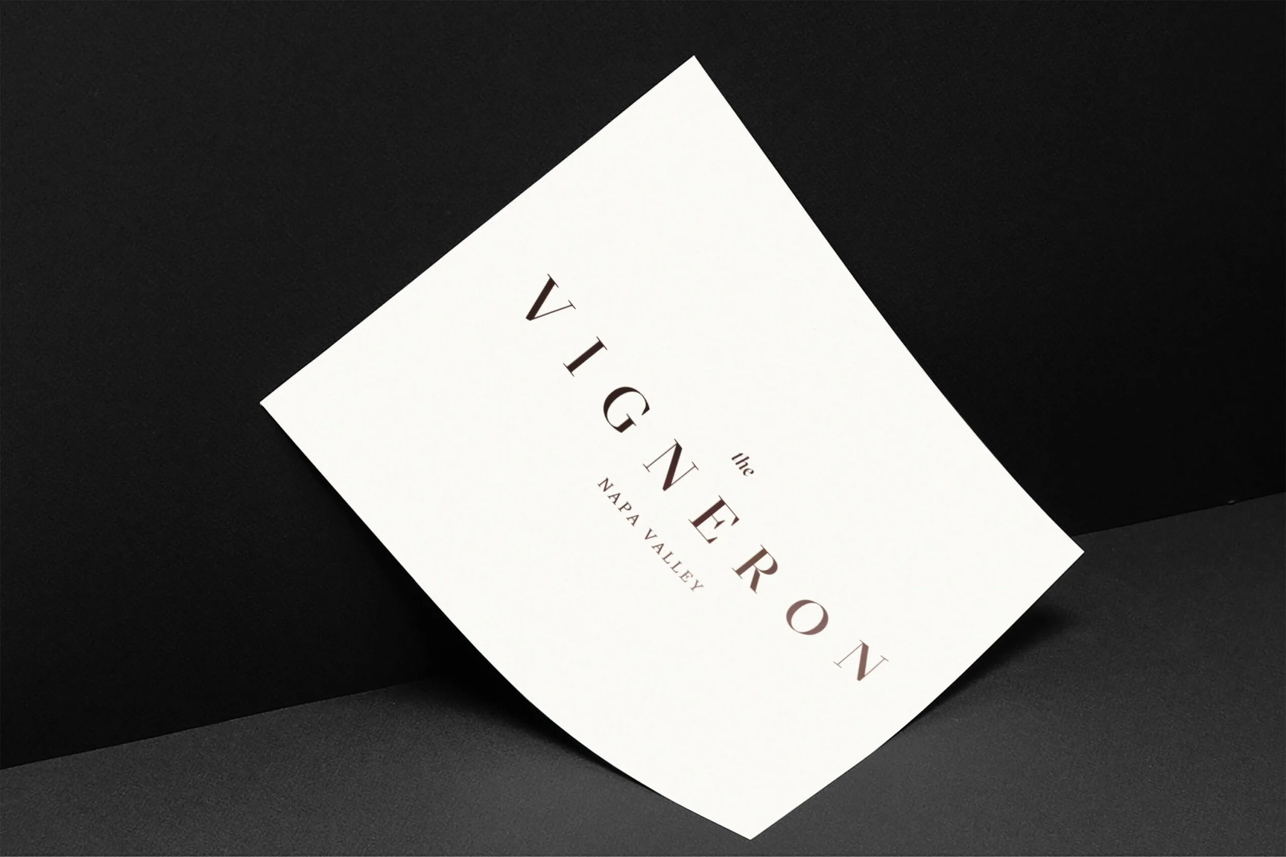
Vigneron Hotel
Interior Design/Branding
Napa Valley, California
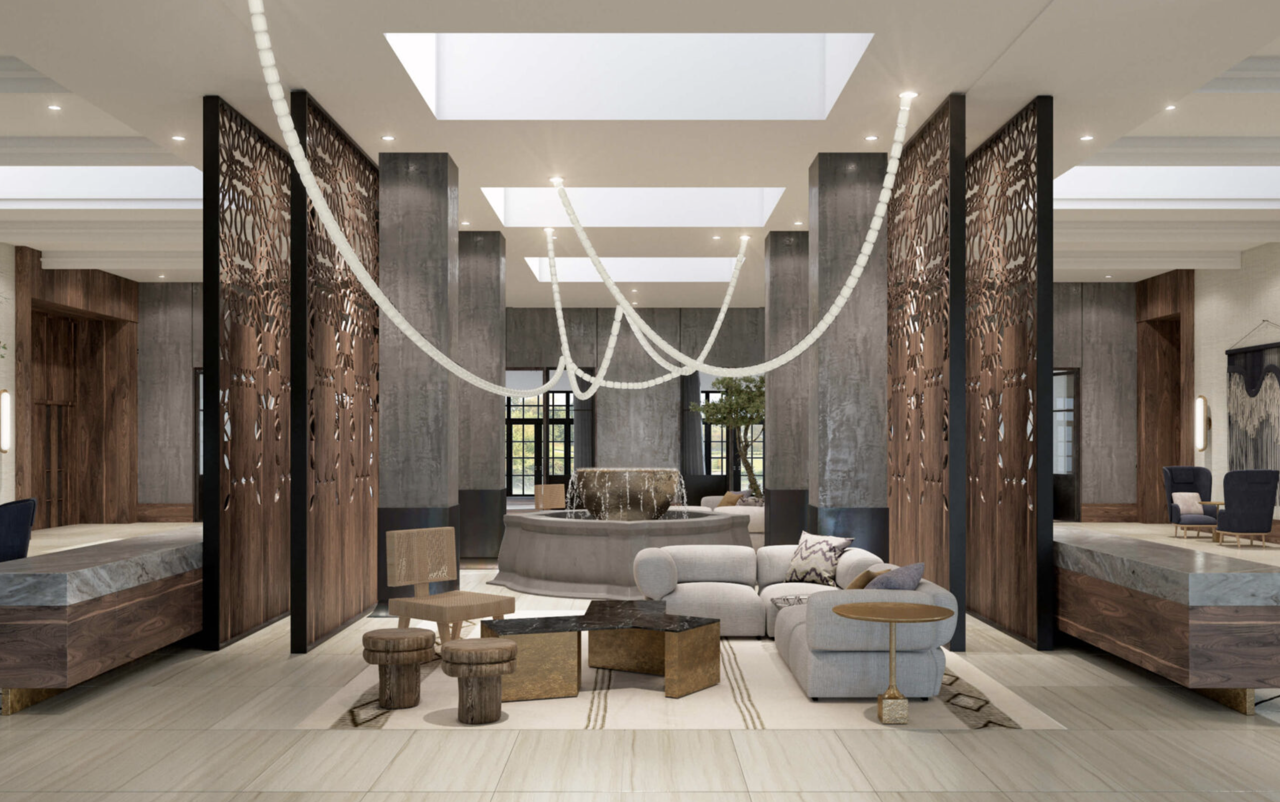
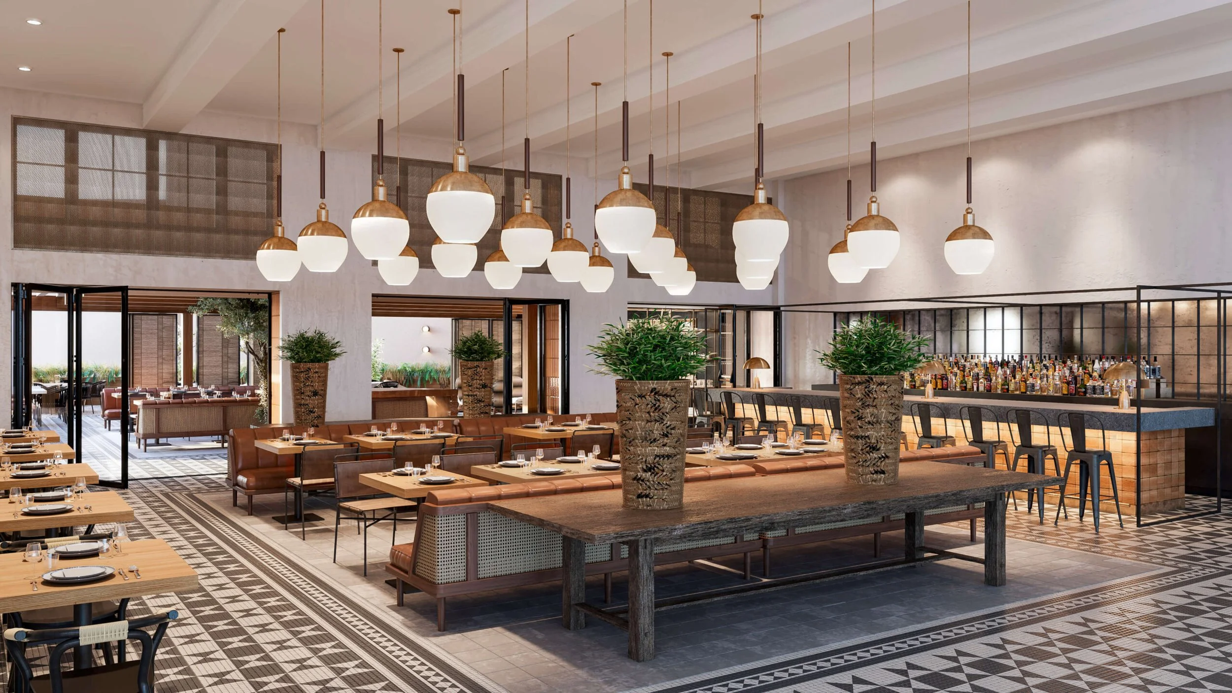
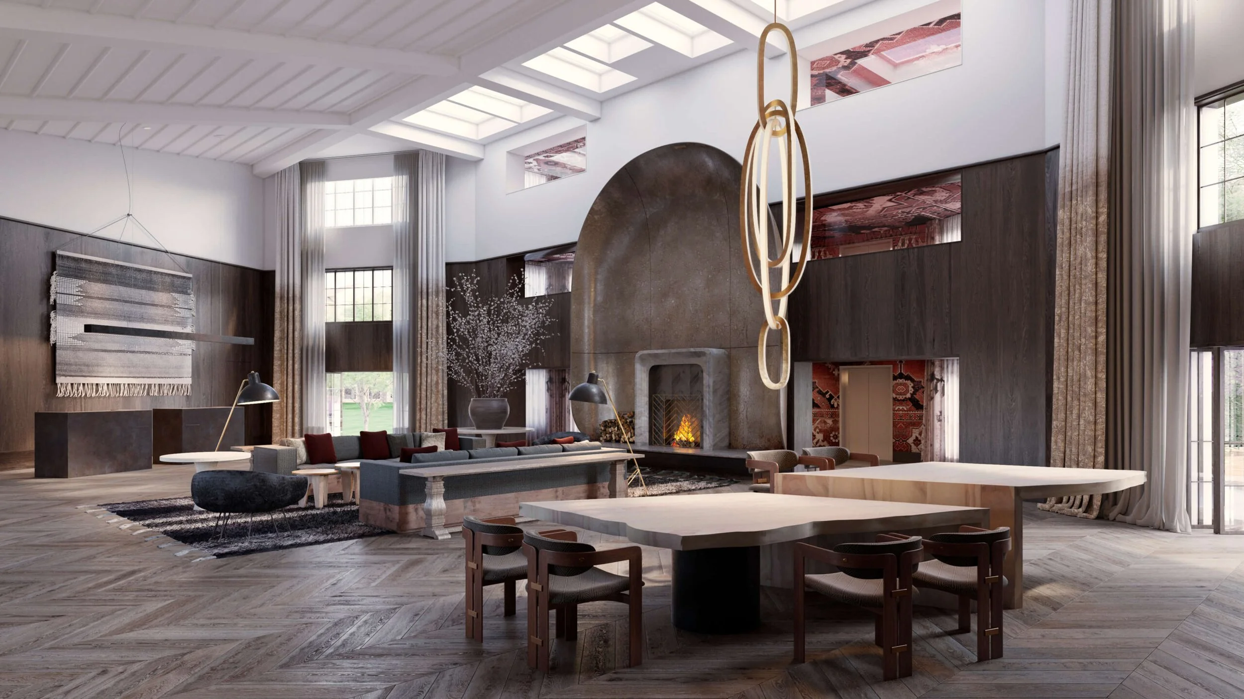
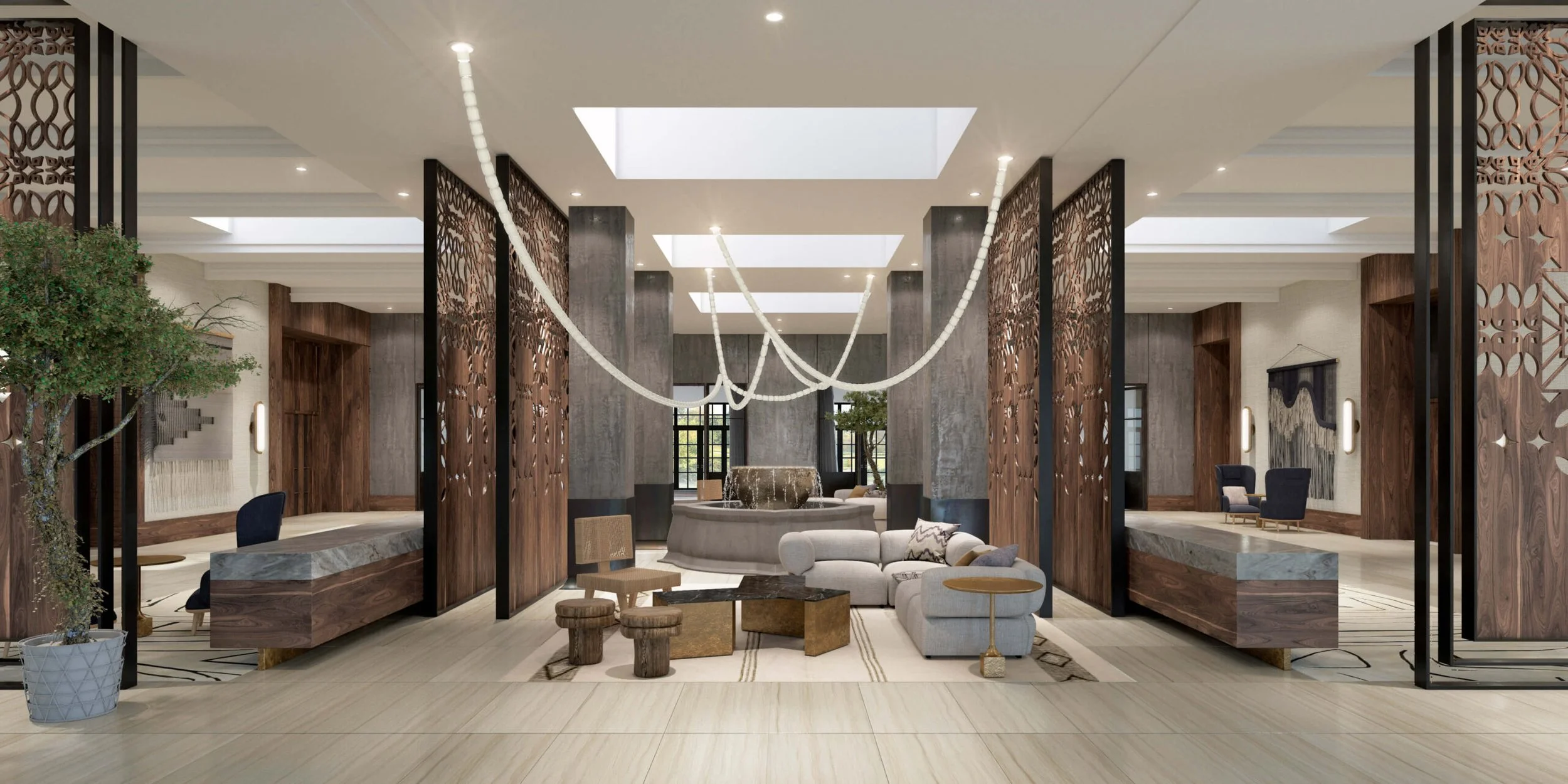
Vigneron Hotel reimagines an existing property through a quieter, more considered lens—where renovation and new interventions are used to clarify rather than transform. The all-day dining space becomes the heart of the experience, shifting naturally with the pace of the day.
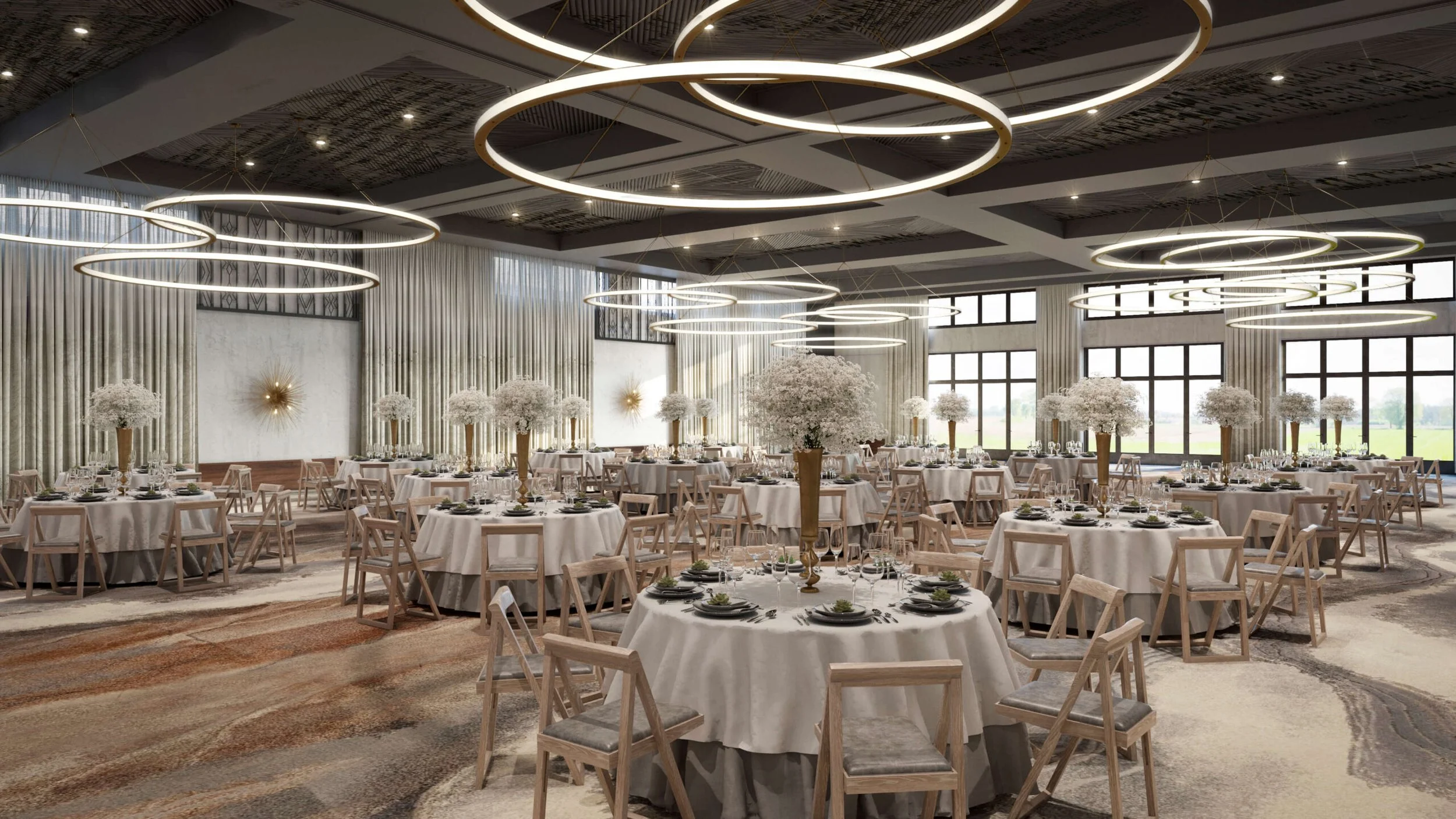
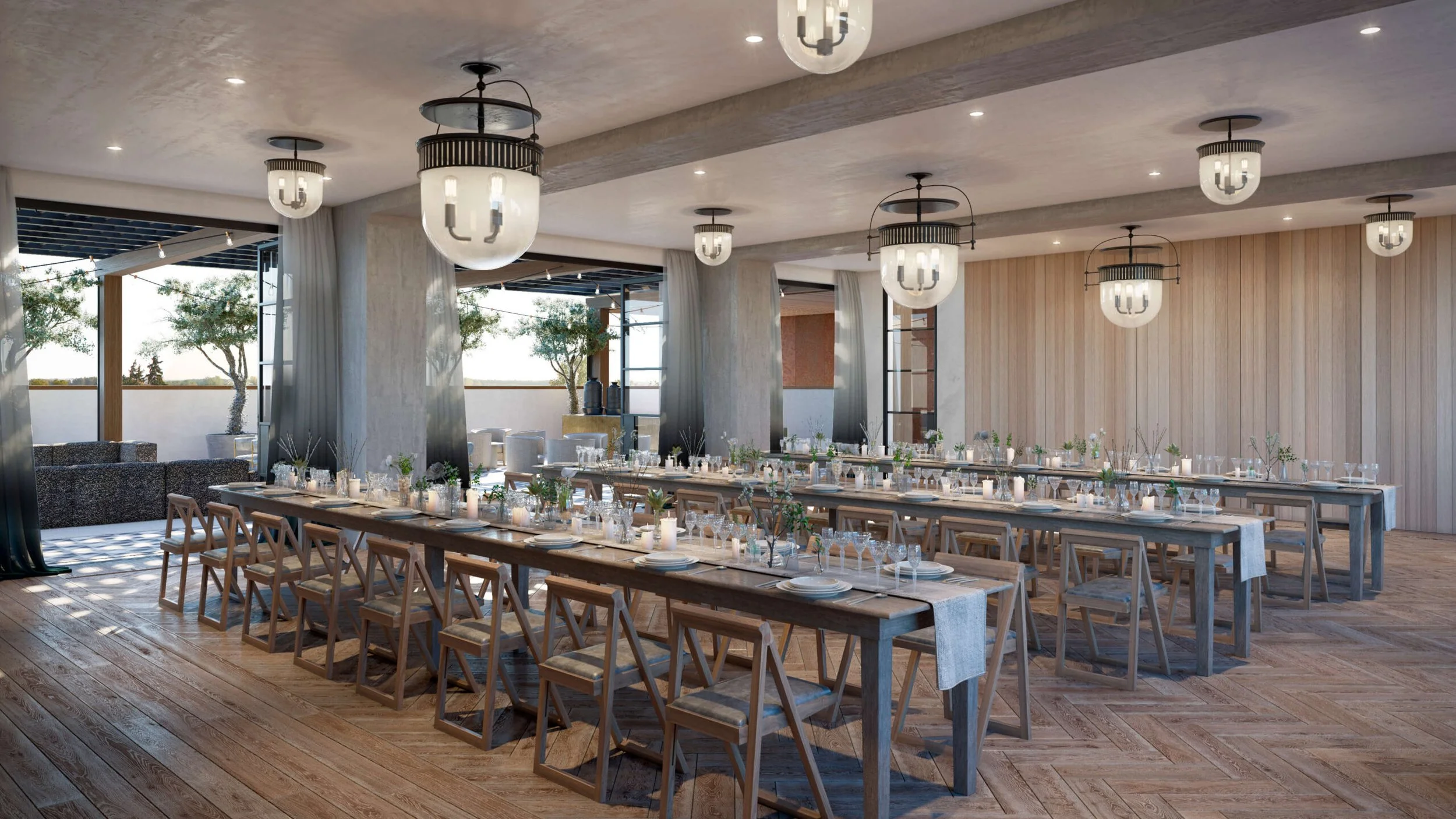
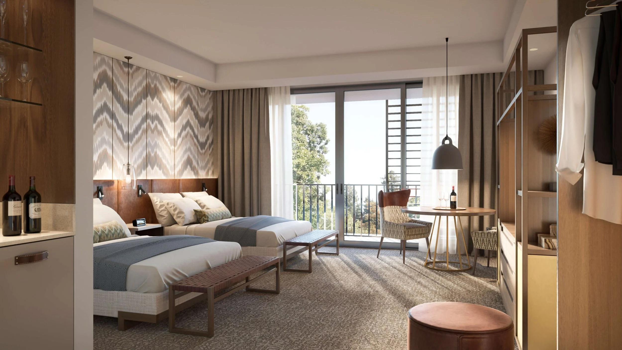
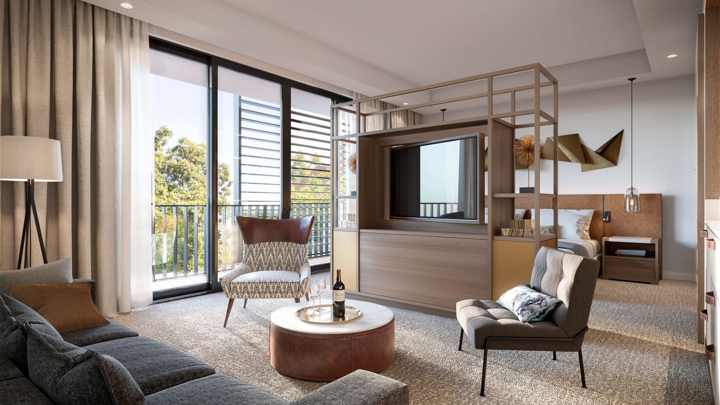
Inside and out are closely connected, with material and proportion carrying the language of Napa forward. The bar introduces a sense of evening energy, extending the life of the space. “Vigneron” speaks to craft and process—an identity that reveals itself gradually rather than all at once.
Brand & Identity Development: The Vigneron
Vēnyəˈrôn; Noun: A person who cultivates grapes for a living. Just as Vigneron is a term familiar to those well versed in the history of Napa and the production of its most precious product, so does the Vigneron hotel represent insider access to the lesser-known, authentic experiences of the valley. The Vigneron acts as the Alchemist, unlocking the secrets of the grapes and turning them into liquid gold. A steward of the valley.
An embodiment of the modern pioneer, Vigneron is connected to the land’s history and ancient vines, while remaining at the very center of progress. The logotype utilizes a condensed sans serif typeface, with specific references to the Engravers style developed in the early 20th century. The mid-weight letterforms are sinewy and workman-like, while the wide letterspacing adds modernity and a subtle meter. The mark speaks to the history of the area, the vigneron, and the open spaces of the valley.
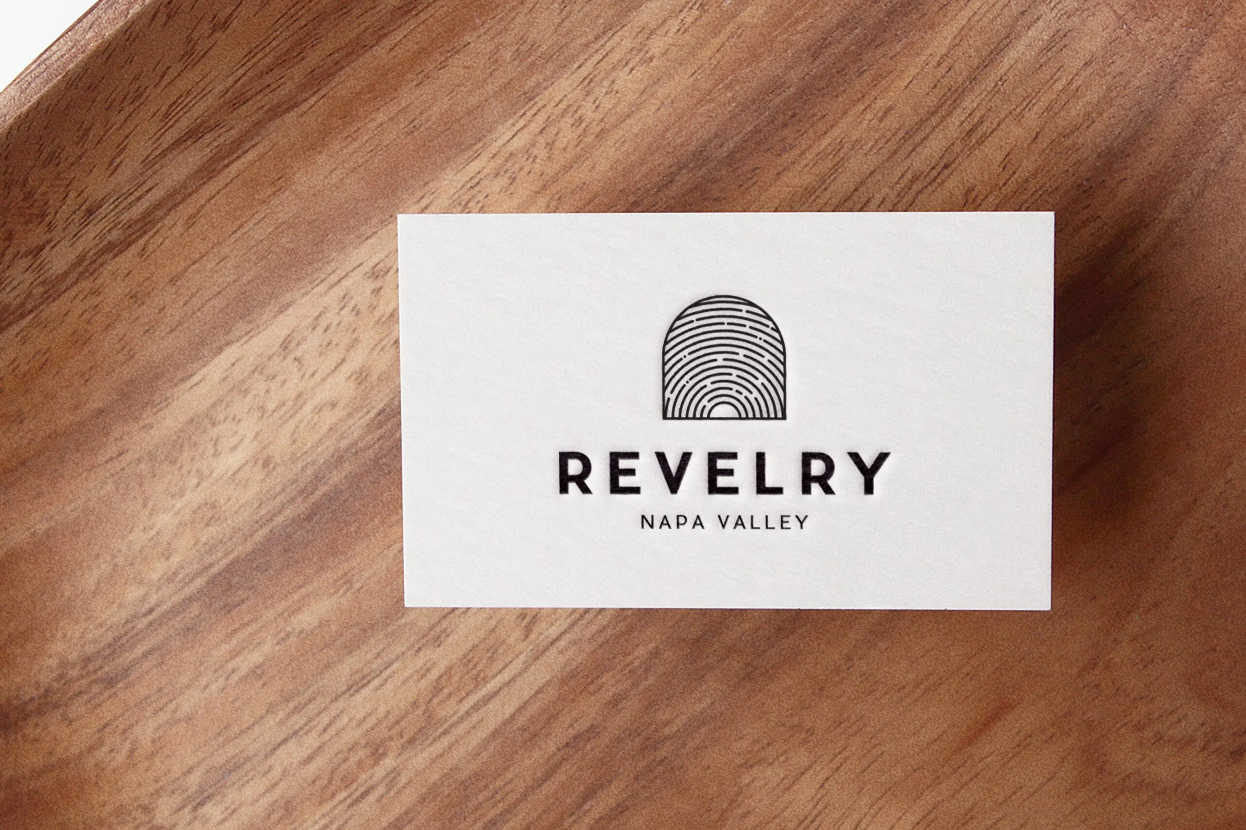
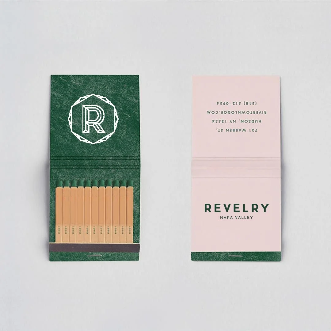
Brand & Identity Development: Revelry
Revəlrē; Noun: A lively festivity, especially one involving alcohol. Evoking the celebratory nature of eating and drinking from the Valley’s bounty, Revelry evokes the simple pleasures of good food and great wine.
A combination of the logotype and the logomark, this lockup provides consumers with all the visual language they need to communicate with the brand.